- Home


Exploring high-dimensional classification boundaries
1 Introduction
Given p-dimensional training data containing d groups (the design space), a
classification algorithm (classifier)
predicts which group new data belongs to. Typically, the classifier is treated
as a black box and the
focus is on finding classifiers with good predictive accuracy. For many problems
the ability to predict new
observations accurately is sufficient, but it is very interesting to learn more
about how the algorithms operate
under different conditions and inputs by looking at the boundaries between
groups. Understanding the
boundaries is important for the underlying real problem because it tells us how
the groups differ. Simpler,
but equally accurate, classifiers may be built with knowledge gained from
visualising the boundaries, and
problems of overfitting may be intercepted.
Generally the input to these algorithms is high dimensional, and the resulting
boundaries will thus be
high dimensional and perhaps curvilinear or multi-facted. This paper discusses
methods for understanding
the division of space between the groups, and provides an implementation in an R
package, explore, which
links R to GGobi. It provides a fluid environment for experimenting with
classification algorithms and their
parameters and then viewing the results in the original high dimensional design
space.
2 Classification regions
One way to think about how a classifier works is to look at how it divides up
the design space into the d
different groups. Each family of classifiers does this in a distinctive way. For
example, linear discriminant
analysis divides up the space with straight lines, while trees recursively split
the space into boxes. Generally,
most classifiers produce connected areas for each group, but some, e.g.
k-nearest neighbours, do not. We
would like a method that is flexible enough to work for any type of classifier.
Here we present two basic
approaches: we can display the boundaries between the different regions, or
display all the regions, as shown
in figure 1.
Typically in pedagogical 2D examples, a line is drawn between the different
classification regions. However,
in higher dimensions and with complex classification functions determining this
line is difficult. Using
a line implies that we know the boundary curve at every point—we can describe
the boundary explicitly.
However, this boundary may be difficult or time consuming to calculate. We can
take advantage of the fact
that a line is indistinguishable from a series of closely packed points. It is
easier to describe the position of a
discrete number of points instead of all the twists and turns a line might make.
The challenge then becomes
generating a sufficient number of points that an illusion of a boundary is
created.
It is also useful to draw two boundary lines, one for each group on the
boundary. This makes it easy
to tell which group is on which side of the boundary, and it will make the
boundary appear thicker, which
is useful in higher dimensions. Finally, this is useful when we have many groups
in the data or convoluted
boundaries, as we may want to look at the surface of each region separately.
Another approach to visualising a classifier is to display the classification
region for each group. A
classification region is a high dimensional object and so in more than two
dimensions, regions may obsure
each other. Generally, we will have to look at one group at a time, so the other
groups do not obscure our
view. We can do this in ggobi by shadowing and excluding the points in groups
that we are not interested in,
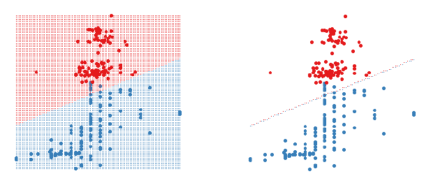
Figure 1: A 2D LDA classifier. The figure on the left shows the classifier
region by shading the different
regions different colours. The figure on the right only shows the boundary
between the two regions. Data
points are shown as large circles.
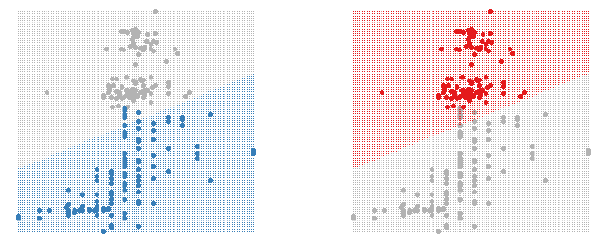
Figure 2: Using shadowing to highlight the classifier region for each group.
as seen in figure 2. This is easy to do in GGobi using the colour and glyph
palette, figure 3. This approach
is more useful when we have many groups or many dimensions, as the boundaries
become more complicated
to view.
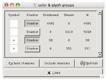
Figure 3: The colour and glyph panel in ggobi lets us easily choose which groups
to shadow.
3 Finding boundaries
As mentioned above, another way to display classification functions is to show
the boundaries between
the different regions. How can we find these boundaries? There are two basic
methods: explicitly from
knowledge of the classification function, or by treating the classifier as a
black box and finding the boundaries
numerically. The R package, explore can use either approach. If an explicit
technique has been programmed
it will use that, otherwise it will fall back to one of the slower numerical
approaches.
For some classifiers it is possible to find a simple parametric formula that
describes the boundaries
between groups. Linear discriminant analysis and support vector machines are two
techniques for which
this is possible. In general, however, it is not possible to extract an explicit
functional representation of the
boundary from most classification functions, or it is tedious to do so.
Most classification functions can output the posterior probability of an
observation belonging to a group.
Much of the time we don’t look at these, and just classify the point to the
group with the highest probability.
Points that are uncertain, i.e. have similar classification probabilities for
two or more groups, suggest that
the points are near the boundary between the two groups. For example, if point A
is in group 1 with
probability 0.45, and group 2 in probability 0.55, then that point will be close
to the boundary between the
two groups. An example of this in 2D is shown in figure 4.
We can use this idea to find the boundaries. If we sample points throughout the
design space we can
then select only those uncertain points near boundaries. The thickness of the
boundary can be controlled
by changing the value which determines whether two probabilities are similar or
not. Ideally, we would like
this to be as small as possible so that our boundaries are accurate. However,
the boundaries are a p − 1
dimensional structure embedded in a p dimensional space, which means they take
up 0% of the design space.
We will need to give the boundaries some thickness so that we can see them.
Some classification functions do not generate posterior probabilities, for
example, nearest neighbour
classification using only one neighbour. In this case, we can use a k-nearest
neighbours approach. Here we
look at each point, and if all its neighbours are of the same class, then the
point is not on the boundary and
can be discarded. The advantage of this method is that it is completely general
and can be applied to any
classification function. The disadvantage is that it is slow (O(n2)), because it
computes distances between
all pairs of points to find the nearest neighbours. In practice, this seems to
impose a limit of around 20,000
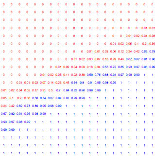
Figure 4: Posterior probabilty of each point belonging to the blue group, as
shown in previous examples.
points for moderately fast interactive use. To control the thickness of the
boundaries, we can adjust the
number of neighbours used.
There are three important considerations with these numerical approaches. We
need to ensure the number
of points is sufficient to create the illusion of a surface, we need to
standardise variables correctly to ensure
that the boundary is sharp, and we need an approach to fill the design space
with points.
As the dimensionality of the design space increases, the number of points
required to make a perceivable
boundary increases. This is the “curse of dimensionality” and is because the
same number of points need to
spread out across more dimensions. We can attack this in two ways: by increasing
the number of points we
use to fill the design space, and by increasing the thickness of the boundary.
The number of points we can use
depends on the speed of the classification algorithm and the speed of the
visualisation program. Generating
the points to fill the design space is rapid, and GGobi can comfortable display
up to around 100,000 points.
This means the slowest part is classifying these points, and weeding out
non-boundary points. This depends
entirely on the classifier used.
To fill the design space with points, there are two simple approaches, using a
uniform grid, or a random
sample (figure 5). The grid sometimes produces distracting visual artefacts,
especially when the design space
is high dimensional. The random sample works better in high-D but generally
needs many more points to
create the illusion of solids. If we are trying to find boundaries then both of
these approaches start to break
down as dimensionality increases.
Scaling is one final important consideration. When we plot the data points, each
variable is implicitly
scaled to [0, 1]. If we do not scale the variables explicitly, boundaries
discovered by the algorithms above
will not appear solid, because some variables will be on a different scale. For
this reason, it is best to scale
all variables to [0, 1] prior to analysis so that variables are treated equally
for classification algorithm and
graphic.
4 Visualising high D structures
The dimensionality of the classifier is equal to the number of predictor
variables. It is easy to view the results
with two variables on a 2D plot, and relatively easy for three variables in a 3D
plot. What can we do if we
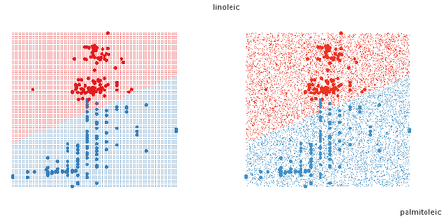
Figure 5: Two approaches to filling the space with points. On the left, a
uniform grid, on the right a random
sample.
have more than 3 dimensions? How do we understand how the classifier divides up
the space? In this section
we describe the use of tour methods—the grand tour, the guided tour and manual
controls [1, 2, 3]—for
viewing projections of high-dimensional spaces and thus classification
boundaries.
The grand tour continuously and smoothly changes the projection plane so we see
a movie of different
projections of the data. It does this by interpolating between randomly chosen
projections. To use the
grand tour, we simply watch it for a while waiting to see an illuminating view.
Depending on the number of
dimensions and the complexity of the classifier this may happen quickly or take
a long time.
The guided tour is an extension of the grand tour. Instead of choosing new
projections randomly, the
guided tour picks “interesting” views that are local maxima of a projection
pursuit function.
We can use manual controls to explore the space intricately. Manual controls
allow the user to control
the projection coefficient for a particular variable, thus controlling the
rotation of the projection plane. We
can use manual controls to explore how the different variables affect the
classification region.
One useful approach is to use the grand or guided tour to find a view that does
a fairly good job of
displaying the separation and then use manual controls on each variable to find
the best view. This also
helps you to understand how the classifier uses the different variables. This
process is illustrated in figure 6.
5 Examples
The following examples use the explore R package to demonstrate the techniques
described above. We use
two datasets: the Fisher’s iris data, three groups in four dimensions, and part
of the olive oils data with two
groups in eight dimensions. The variables in both data sets were scaled to range
[0, 1]. Understanding the
classification boundaries will be much easier in the iris data, as the number of
dimensions is much smaller.
The explore package is very simple to use. You fit your classifier, and then
call the explore function,
as follows:
iris_qda <- qda(Species ~ Sepal.Length + Sepal.Width + Petal.Length +
Petal.Width, iris)
explore(iris_qda, iris, n=100000)
Here we fit a QDA classifier to the iris data, and then call explore with the
classifier function, the
original dataset, and the number of points to generate while searching for
boundaries. We can also supply
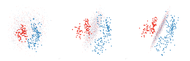
Figure 6: Finding a revealing projection of an LDA boundary. First we use the
grand tour to find a promising
initial view where the groups are well separated. Then we tweak each variable
individually. The second graph
shows progress after tweaking each variable once in order, and the third after a
further series of tweakings.
arguments to determine the method used for filling the design space with points
(a grid by default), and
whether only boundary points should be returned (true by default). Currently,
the package can deal with
classifiers generated by LDA [15], QDA [15], SVM [5], neural networks [15],
trees [13], random forests [11]
and logistic regression.
The remainder of this section demonstrates results from LDA, QDA, svm, rpart and
neural network
classifiers.
5.1 Linear discriminant analysis (LDA)
LDA is based on the assumption that the data from each group comes from a
multivariate normal distribution
with common variance-covariance matrix across all groups [7, 8, 10]. This
results in a linear hyperplane that
separates the two regions. This makes it easy to find a view that illustrates
how the classifier works even in
high dimensions, as shown in figure 7.
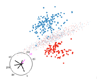
Figure 7: LDA discriminant function. LDA classifiers are always easy to
understand.
5.2 Quadratic discriminant analysis (QDA)
QDA is an extension of LDA that relaxes the assumption of a shared
variance-covariance matrix and gives
each group its own variance matrix. This leads to quadratic boundaries between
the regions. These are easy
to understand if they are convex (i.e. all components of the quadratic function
are positive or negative).
Figure 8 shows the boundaries of the QDA of the iris data. We need several views
to understand the
shape of the classifier, but we can see it essentially a convex quadratic around
the blue group with the red
and green groups on either side.
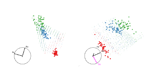
Figure 8: Two views illustrating how QDA separates the three groups of the iris
data set
The quadratic classifier of the olive oils data is much harder to understand and
it is very difficult to find
illuminating views. Figure 9 shows two views. It looks like the red group is the
“default”, even though it
contains fewer points. There is a quadratic needle wrapped around the blue group
and everything outside
it is classified as red. However, there is a nice quadratic boundary between the
two groups, shown in figure
10. Why didn’t QDA find this boundary?
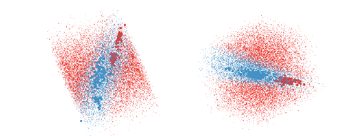
Figure 9: The QDA classifier of the olive oils data is much harder to understand
as there is overlap between the
groups in almost every projection. These two views show good separations and
together give the impression
that the blue region is needle shaped.
5.3 Support vector machines (SVM)
SVM is a binary classification method that finds a hyperplane with the greatest
separation between the two
groups. It can readily be extended to deal with multiple groups, by separating
out each group sequentially,
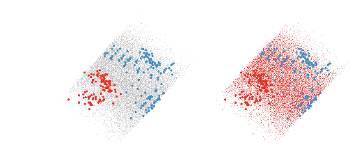
Figure 10: The left view shows a nice quadratic boundary between the two groups
of points. The right view
shows points that are classified into the red group.
and with non-linear boundaries, by changing the distance measure [4, 9, 14].
Figures 11, 12, and 13 show
the results of the SVM classification with linear, quadratic and polynomial
boundaries respectively. SVM
do not natively output posterior probabilities. Techniques are available to
compute them [6, 12], but have
not yet been implemented in R. For this reason, the figures below display the
full regions rather than the
boundaries. This also makes it easier to see these more complicated boundaries.
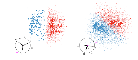
Figure 11: SVM with linear boundaries. Linear boundaries, like those from SVM or
LDA, are always easy
to understand, it is simply a matter of finding a projection that projects
hyperplane to a line. These are
easy to find whether we have points filling the region, or just the boundary.
6 Conclusion
These techniques provide a useful toolkit for interactively exploring the
results of a classification algorithm.
We have a discussed several boundary finding methods. If the classifier is
mathematically tractable we can
extract the boundaries directly; if the classifier provides posterior
probabilities we can use these to find
uncertain points which lie on boundaries; otherwise we can treat the classifier
as a black box and use a
k-nearest neighbours technique to remove non-boundary points. These techniques
allow us to work with any
classifier, and we have demonstrated LDA, QDA, SVM, tree and neural net
classifiers.
Currently, the major limitation is the time it takes to find clear boundaries in
high dimensions. We
have explored methods of non-random sampling, with higher probability of
sampling near existing boundary
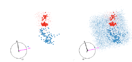
Figure 12: SVM with quadratic boundaries. On the left only the red region is
shown, and on the right both
red and blue regions are shown. This helps us to see both the extent of the
smaller red region and how the
blue region wraps around it.
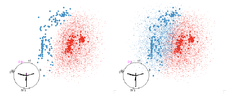
Figure 13: SVM with polynomial boundaries. This classifier picks out the
quadratic boundary that looked
so good in the QDA examples, figure 10.
points, but these techniques have yet to bear fruit. A better algorithm for
boundary detection would be very
useful, and is an avenue for future research.
Additional interactivity could be added to allow the investigation of changing
aspects of the data set, or
parameters of the algorithm. For example, imagine being able to select a point
in GGobi, remove it from the
data set and watch as the classification boundaries change. Or imagining
dragging a slider that represents
a parameter of the algorithm and seeing how the boundaries move. This clearly
has much pedagogical
promise—as well as learning the classification algorithm, students could learn
how each classifier responds
to different data sets.
Another extension would be to allow the comparison of two or more classifiers.
One way to do this is
to just show the points where the algorithms differ. Another way would be to
display each classifier in a
separate window, but with the views linked so that you see the same projection
of each classifier.
References
[1] D. Asimov. The grand tour: A tool for viewing multidimensional data. SIAM
Journal of Scientific and
Statistical Computing, 6(1):128–143, 1985.
[2] A. Buja, D. Cook, D. Asimov, and C. Hurley. Dynamic projections in
high-dimensional visualization:
Theory and computational methods. Technical report, AT&T Labs, Florham Park, NJ,
1997.
[3] D. Cook, A. Buja, J. Cabrera, and C. Hurley. Grand tour and projection
pursuit. Journal of Computational
and Graphical Statistics, 4(3):155–172, 1995.
[4] Corinna Cortes and Vladimir Vapnik. Support-vector networks. Machine
Learning, 20(3):273–297,
1995.
[5] Evgenia Dimitriadou, Kurt Hornik, Friedrich Leisch, David Meyer, and Andreas
Weingessel. e1071:
Misc Functions of the Department of Statistics (e1071), TU Wien, 2005. R package
version 1.5-11.
[6] J. Drish. Obtaining calibrated probability estimates from support vector
machines, 2001.
[7] R. Duda, P. Hart, and P. Stork. Pattern Classification. Wiley, New York,
2000.
[8] R.A Fisher. The use of multiple measurements in taxonomic problems. Annals
of Eugenics, 7:179–188,
1936.
[9] M.A. Hearst, B. Skolkopf, S. Dumais, E. Osuna, and J Platt. Support vector
machines. IEEE Intelligent
Systems, 13(4):18–28, 1998.
[10] R. A. Johnson and D. W. Wichern. Applied Multivariate Statistical Analysis
(3rd ed). Prentice-Hall,
Englewood Cliffs, NJ, 1992.
[11] Andy Liaw and Matthew Wiener. Classification and regression by
randomforest. R News, 2(3):18–22,
2002.
[12] John C. Platt. Probabilistic outputs for support vector machines and
comparison to regularized likelihood
methods. In A.J. Smola, P. Bartlett, B. Schoelkopf, and D. Schuurmans, editors,
Advances in
Large Margin Classifiers, pages 61–74. MIT Press, 2000.
[13] Terry M Therneau and Beth Atkinson. R port by Brian Ripley. rpart: Recursive
Partitioning, 2005. R package version 3.1-24.
[14] V. Vapnik. The Nature of Statistical Learning Theory (Statistics for
Engineering and Information
Science). Springer-Verlag, New York, NY, 1999.
10
[15] W. N. Venables and B. D. Ripley. Modern Applied Statistics with S.
Springer, New York, fourth edition,
2002. ISBN 0-387-95457-0.
11